Specialized Bicycles

Specialized Bicycles

Design System

Design System

My role

UI Designer

Team

SCOM

Project Overview

Project Overview

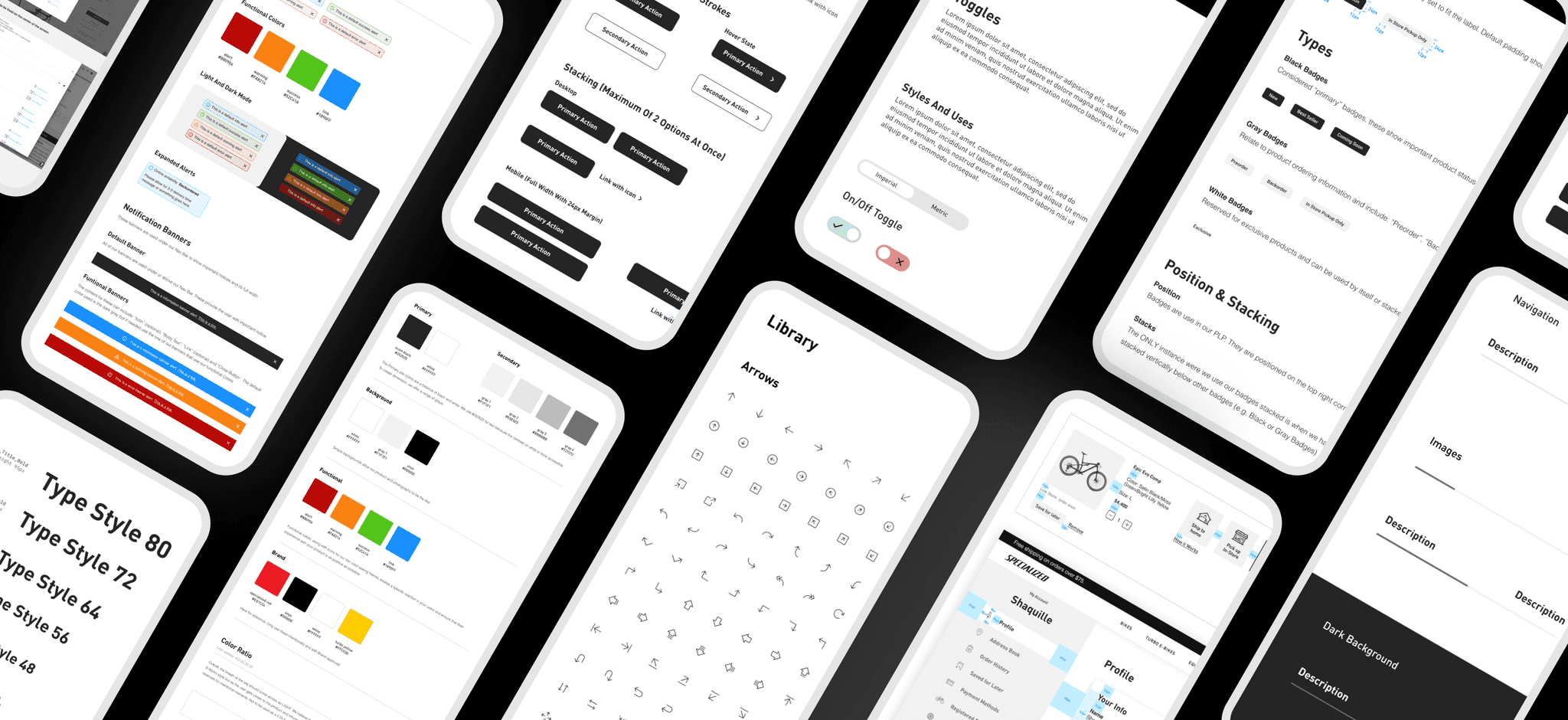
Design systems play a crucial role in establishing consistency, scalability, and efficiency in the design and development process. As a UI Designer, for Specialized I had the opportunity to solidify a unified language across our site. The goal was to create consistent elements across products, channels, and potentially cross-functional teams. This Design System is a guide and library that serves all of those involved in the creation of Specialized.com. Here's an overview of the key steps involved in designing a robust Design System.

Purpose

The purpose is to establish a cohesive visual identity and consistent user experience across all our digital platforms and products. By aligning with our brand values and business goals, the design system will enable us to create a seamless and recognizable experience for our customers.

Design Process Analysis

In analyzing our design process, we started by understanding and documenting the design stages and steps followed. We assessed collaboration and communication among designers and developers, identifying areas for improvement. We evaluated the effectiveness and suitability of the tools we used, considering factors such as ease of use, collaboration capabilities, and integration. Based on our analysis, we identified gaps and opportunities for improvement. Consequently, we made recommendations to optimize the design process, update the toolset, and successfully transition our workflow from Sketch to Figma.

In analyzing our design process, we started by understanding and documenting the design stages and steps followed. We assessed collaboration and communication among designers and developers, identifying areas for improvement. We evaluated the effectiveness the tools we used, considering factors such as ease of use, collaboration capabilities, and integration. Based on our analysis, we identified gaps and opportunities for improvement. We made recommendations to optimize the design process, update the toolset, and successfully transition our workflow from Sketch to Figma.

In analyzing our design process, we started by understanding and documenting the design stages and steps followed. We assessed collaboration and communication among designers and developers, identifying areas for improvement. We evaluated the effectiveness the tools we used, considering factors such as ease of use, collaboration capabilities, and integration. Based on our analysis, we identified gaps and opportunities for improvement. We made recommendations to optimize the design process, update the toolset, and successfully transition our workflow from Sketch to Figma.

Our Priority

We defined design guidelines that reflect brand identity through our site. This includes typography, color palettes, spacing, iconography, and other visual elements. The guidelines ensure maintaining a consistent look and feel, reinforcing our brand identity and enhancing user recognition. We identify the need of communicating the new changes, all the specs and rules for each component. The immediate need was to start with the "Main Components".
Content

Content

Structure & Guidelines

Structure & Guidelines

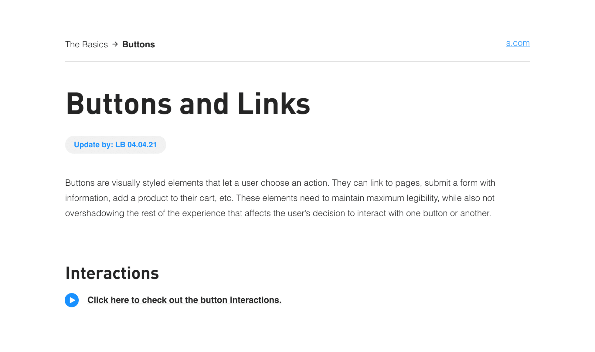
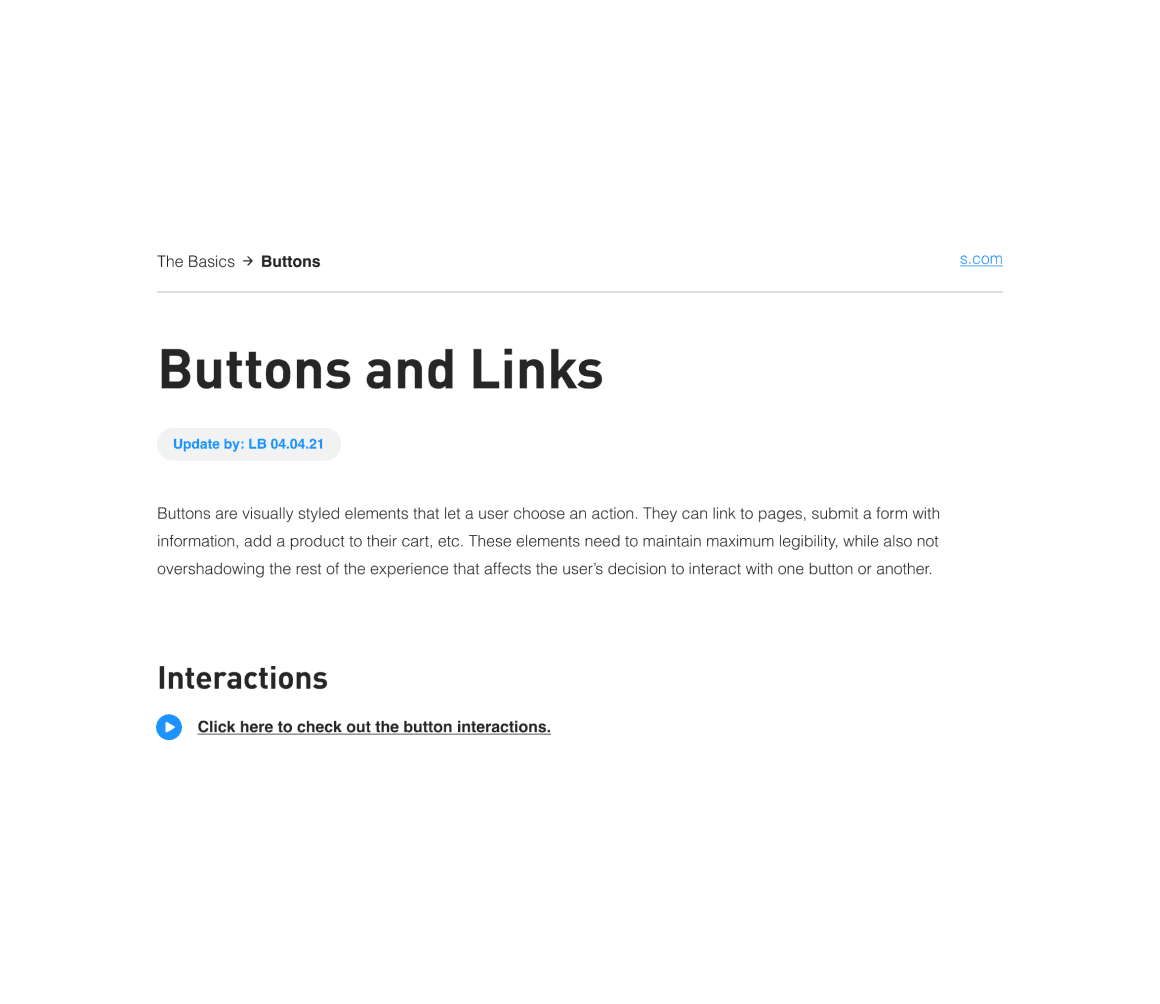
Overview. Brief introduction to the component, including version history, quick links to prototypes or downloadable assets.

Overview. Brief introduction to the component, including version history, quick links to prototypes or downloadable assets.

Overview. Brief introduction to the component, including version history, quick links to prototypes or downloadable assets.

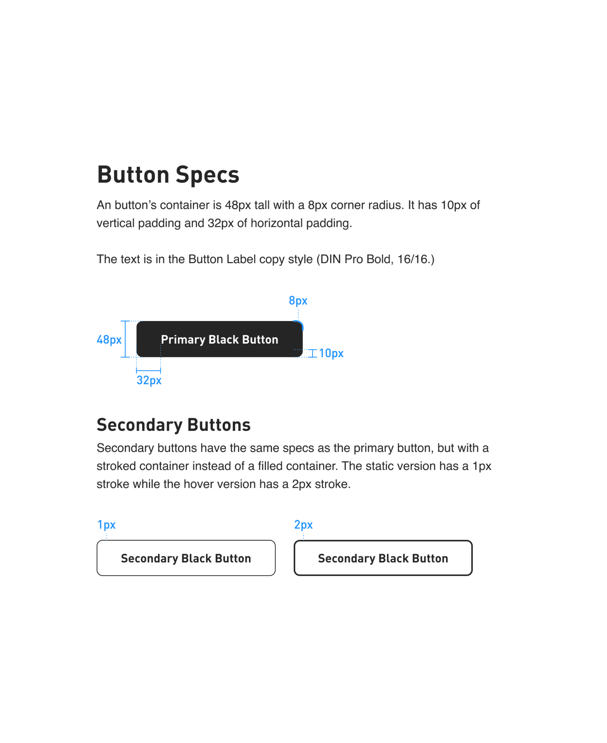
Specs. Detailed specifications and technical information about the component.

Element Breakdown. Includes general rules, guidelines, and usage instructions.

Specs. Detailed specifications and technical information about the component.

Element Breakdown. Includes general rules, guidelines, and usage instructions.

Specs. Detailed specifications and technical information about the component.

Element Breakdown. Includes general rules, guidelines, and usage instructions.

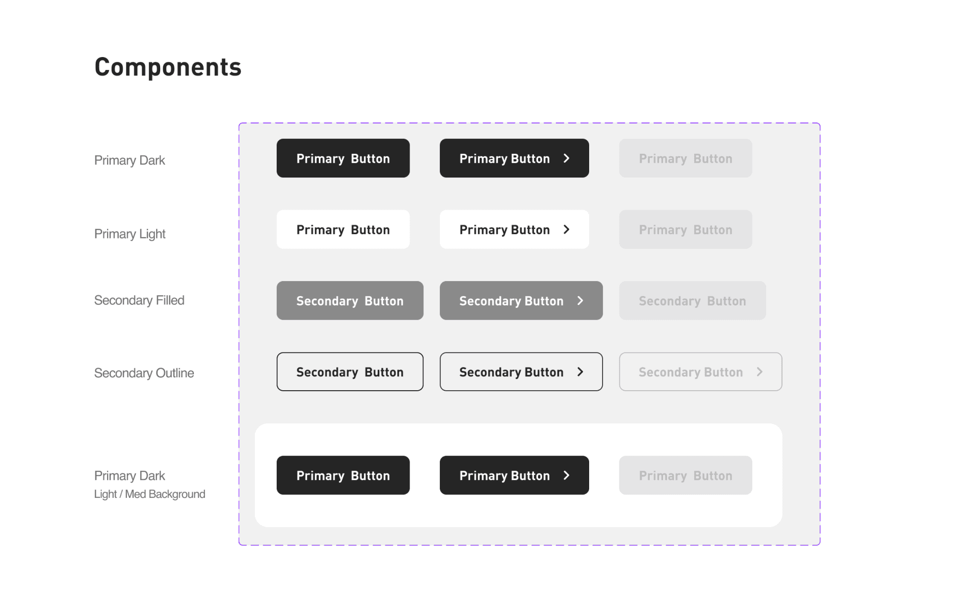
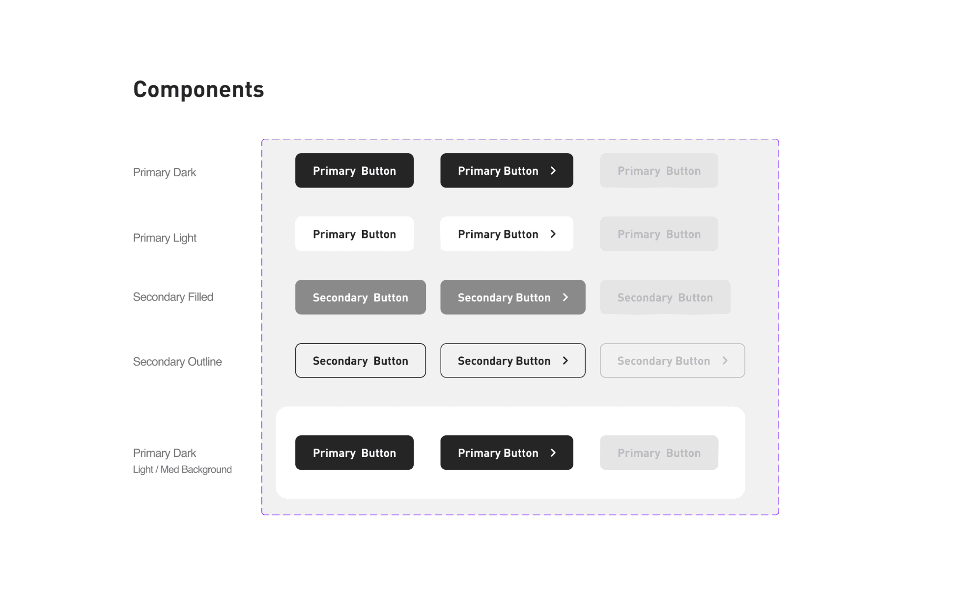
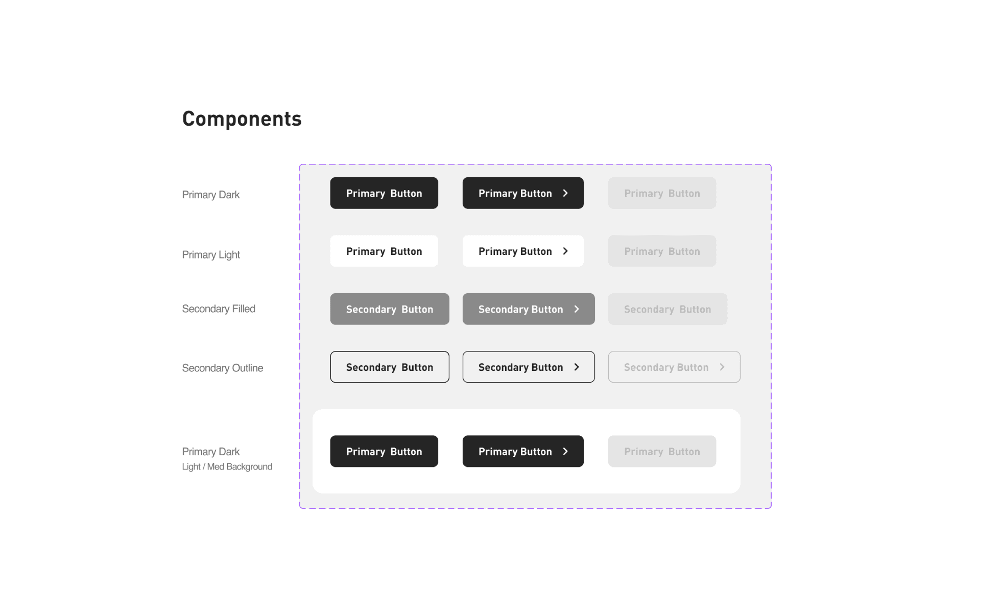
Components. All the sets of reusable components that will be use by the designers.

Components. All the sets of reusable components that will be use by the designers.

Components. All the sets of reusable components that will be use by the designers.

Style Guide

Style Guide

The Basics

The Basics

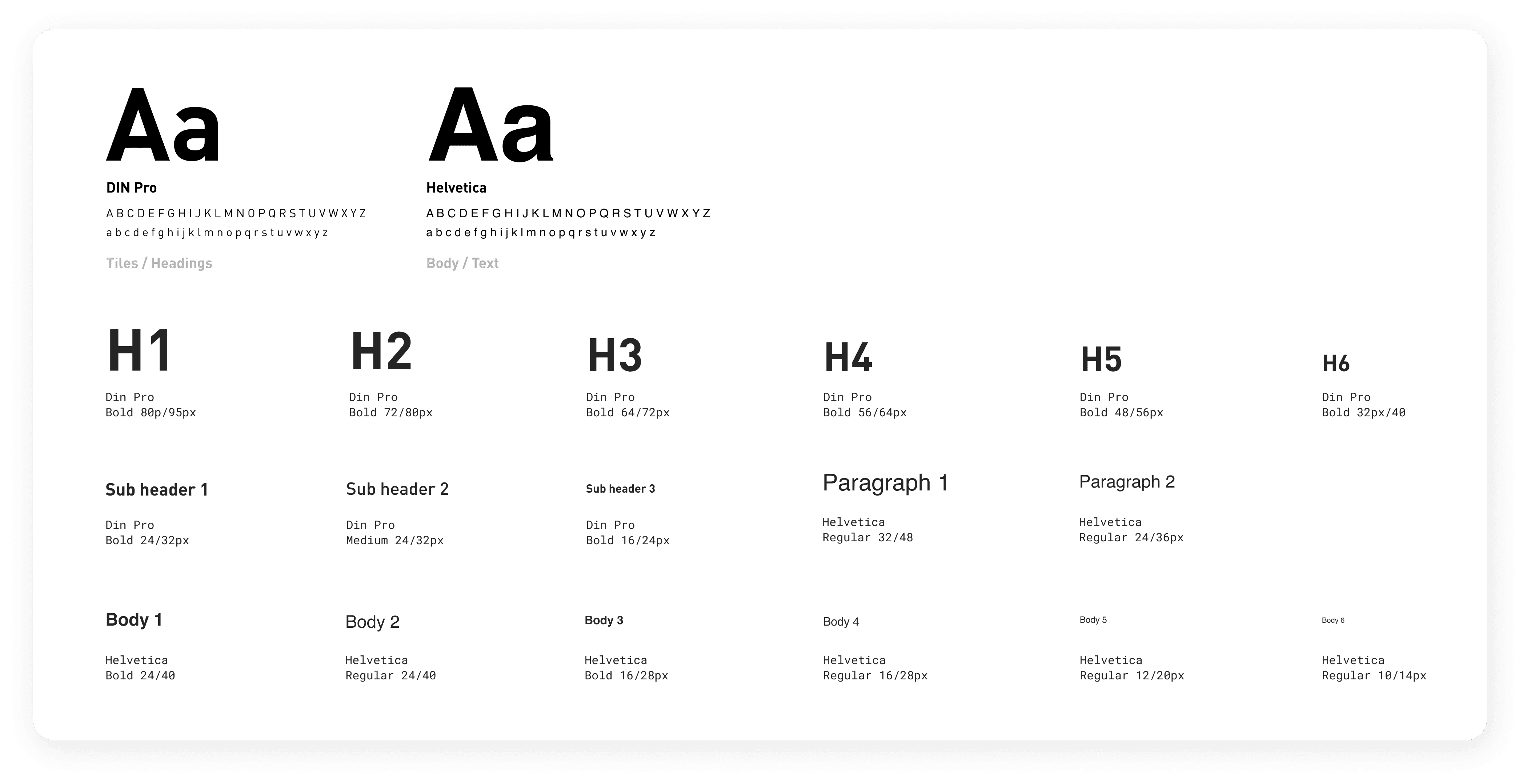
Typography

Typography

Spacing

Spacing

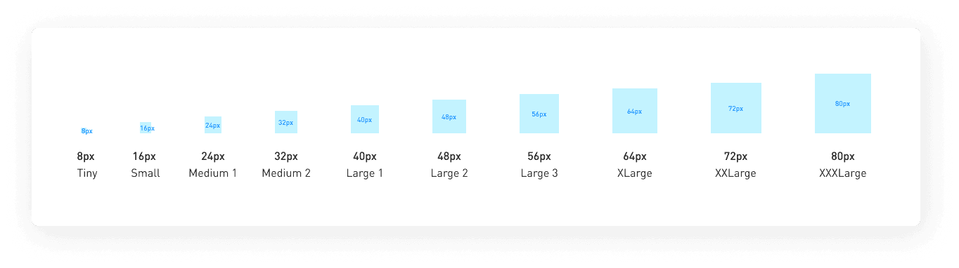
Multiples of 8


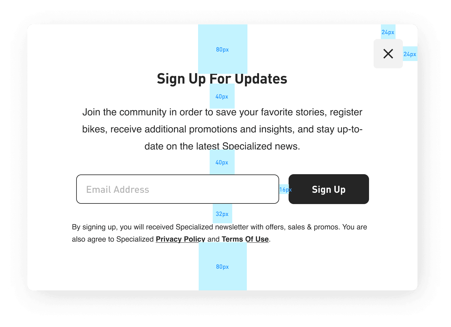
The use of spacing is essential in every design as it plays a crucial role in organizing information, creating rhythm, establishing structure, and defining hierarchy. In our design system, we use spacing guides that are multiples of 8 to align with the grid used by developers, resulting in a more cohesive and streamlined final product.
Border Radius & Shadows

Border Radius & Shadows

Border Radius

Shadows


Only used at modals used in desktop to reflect a higher elevation from the background.

Color: #000000
X: 4 Y: Blur: 20
Spread: 0

Opacity: 15%

Color: #000000 X: 4 Y: Blur: 20. Spread: 0. Opacity: 15%

Elements

Elements

Main Components

Main Components

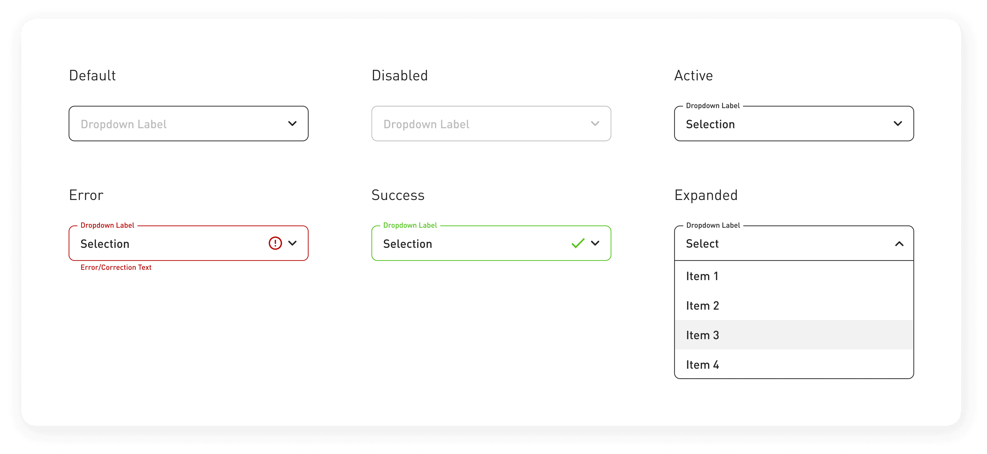
Form Elements

Form Elements

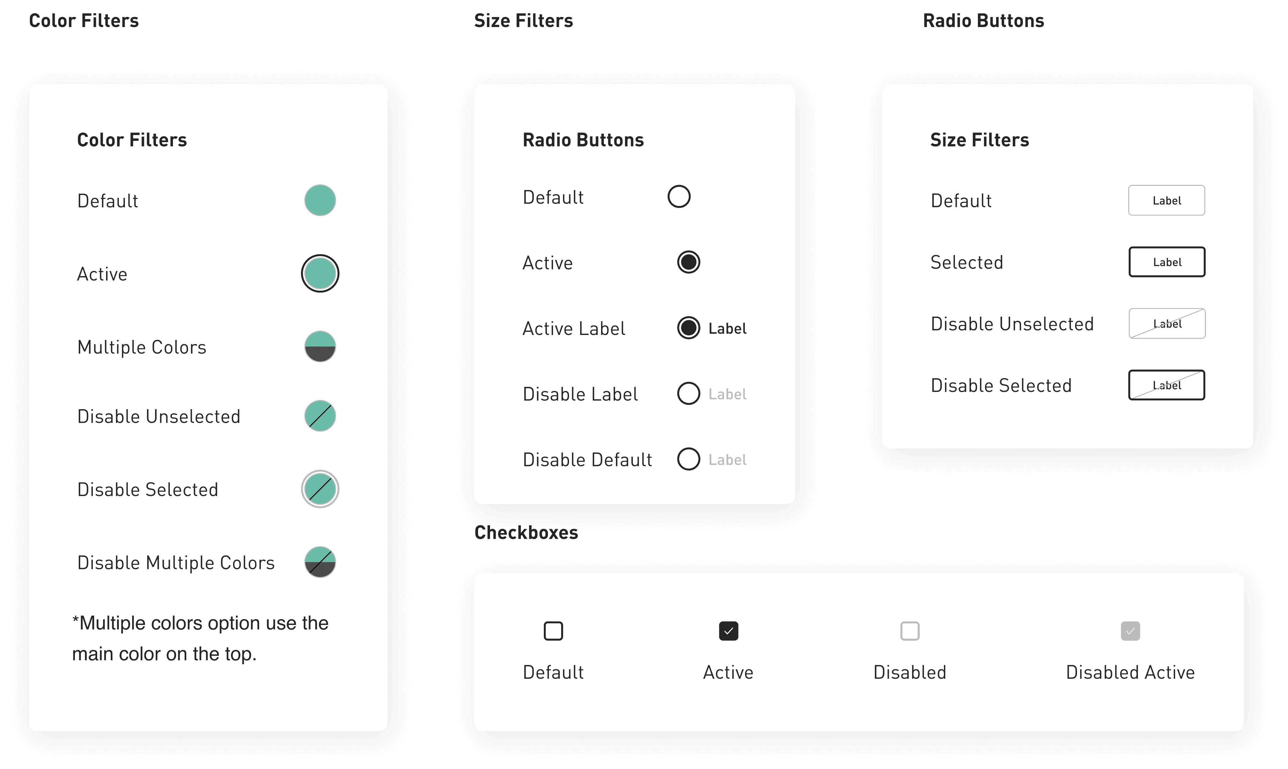
Filters & Radios buttons

Filters & Radios buttons

Other Main Components

Other Main Components

All rights reserved, 2023